I'm so excited to finally be able
to reveal our master bath makeover.
We didn't do a complete overhaul,
just changed a few things that needed
to be freshened up and updated.
I only have a few pictures of how it looked before,
but that's o.k. you'll be able to see the difference!
I thought that I had more pictures in my files
so I didn't take any new ones. Oops!
Our master bath is not a large room
so it is hard to get everything in one shot.
We only have a single sink, but we have
a separate tub and shower.
Are you ready to see what we have
been up to?
Well then, let's get started!
This is what we started with.
I'm sure that this look was in when the previous owner
hung this wallpaper and tile.
To the left of this picture is where our shower area is.
hung this wallpaper and tile.
To the left of this picture is where our shower area is.
This is our sink area.
I was able to snap a quick picture while Hubby was starting to remove the wallpaper.
These are close ups of the wallpaper and the tiles around the tub.
The wallpaper is pink and blue with gold veins and dots throughout.
And the tile was pink, gold and gray.
It was WAY PAST time for an update in this room!
We went from this....
...to THIS!
What a difference, right!?
This picture shows the true paint color.
Who thought that grays could look so pretty?
This picture shows the true paint color.
Who thought that grays could look so pretty?
These are the changes that we did to this room.
1. We removed the wallpaper and painted the room Natural Gray by Behr.
2. Removed the tile around the tub and replaced it with bead board.
3. Painted the trim and bead board Ultra Pure White by Behr.
3. Painted the trim and bead board Ultra Pure White by Behr.
4. Removed the old shower door that was glass with gold trim and replaced it with 2 (84") curtain panels with grommets that I purchased from Bed, Bath & Beyond and added a regular length shower liner. Sorry I don't have a picture of the shower door. Hubby removed it while I was out buying paint.
We will NEVER have another shower door EVER! They are too much work to keep clean!
I didn't want your basic 72" shower curtains because:
1. They are just too short making a small room appear smaller and chopped up.
2. They don't completely cover the tub/shower area from the top of the tub/shower to the floor area.
Tip: By adding 84" drapery panels it tricks your eyes into believing that your
walls are taller than they appear, plus you get more of a designer look
which is what I was aiming for.
Here is a close up of the drapery panels and the shower liner.
A close up of the bead board.
Hubby did a fantastic job hanging the bead board.
You can't even tell where he pieced the pieces together. And how about that caulk line!
Perfection!
5. I swapped out the picture above the tub and replaced it with a bird picture that I found on line. I created 2 prints which I then matted and framed.
6. Spray painted the gold faucet and jets on the tub with Metallic Aluminum by Rust-oleum.
Luckily the floor tile and grout are in excellent shape.
7. Removed the mini blind and replaced it with a custom made Roman shade.
Isn't that material gorgeous?
I have a story about this Roman shade that I will share with you at a later time.
I have a story about this Roman shade that I will share with you at a later time.
The sink area just got a good scrub down.
We had already replaced the old builder grade light fixture a few years earlier.
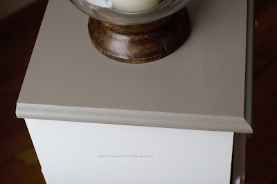
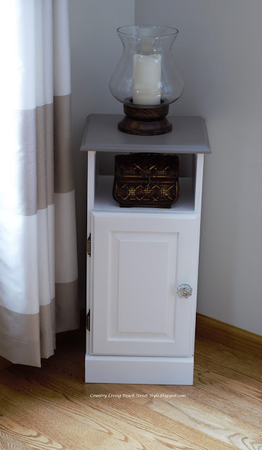
The black thingy on top of the cabinet is a portable wireless speaker that connects with our smartphones so we can listen to music in the bathroom.
Because we are limited to only one sink, I like to keep our sink area clutter free.
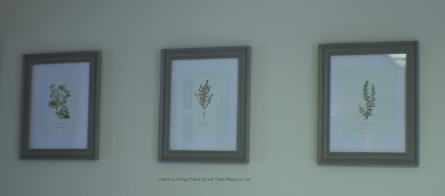
8. And finally, I swapped out the picture that was above the commode with this print that I ordered from Dear Lillie and framed.
This is a view from our master bedroom.
Of course, our photo bomber just had to get in the picture.
There was no way that she was going to move out of the picture!
Of course, our photo bomber just had to get in the picture.
There was no way that she was going to move out of the picture!
We are LOVING our new updated master bath!
It finally looks light and airy.
Hubby and I work good together.
Hubby and I work good together.
I'm the designer and mess cleaner-upper,
and Hubby is the grunt laborer!
I hope you enjoyed our little tour of our master bath update.
Next up is the half bath!
That's it for this week.
Until Next Time,
Veronica
Next up is the half bath!
That's it for this week.
Until Next Time,
Veronica


